One of my favorite things on the internet is this monologue from the perspective of Comic Sans (NSFW). It’s a font that receives a lot of hate (and it definitely is far too ubiquitous in my opinion). (Another favorite is the SNL skit devoted to the choice of Papyrus for the Avatar poster). But the big take away from this to me is that inherently fonts have personalities. As a result, choosing the right fonts can have a big impact on how a client responds to a design.
There are fun fonts, serious fonts, casual fonts, sleek fonts, retro fonts, etc. Typography dominates our experience of the world in a way that we can’t fully appreciate until we start thinking about it seriously when we’re wanting a specific reaction from someone. That’s why choosing a font for your brand or your design presentations is so important. Your choice of font will have an impact on how your client views the design(s) you’re presenting. Therefore, choose a font or two that’s going to influence the reaction you’re looking for.
Firstly, when I’m looking at interior design presentations, there is a dead give away when looking at an amateur’s presentation versus a professional’s presentation. If you use a default font like Calibri in a presentation, 99 times out of 100 it’s not because it’s the best font for the task, but rather it’s because you didn’t bother choosing the right font for the text. From now on, make an active choice.
Now, if you’re focusing on branding yourself as a specific designer for a specific kind of client, you will want to be specific in your choices of fonts on your website, CV, portfolio, etc. But you may also want to have some reliable choices of fonts for your presentations. That is project proposals, concept presentations, etc. There can be specific fonts that will support your design more effectively.
Before we get into some font choices, let’s go over some basics when it comes to typography.
Firstly, make sure you understand the differences between the basic types.
- Serif fonts – Serif fonts are the fonts that have the little tails on the letters, i.e. the serifs. Times New Roman is probably one of the most famous serif fonts.
- Sans-serif fonts – Sans-serif fonts are the fonts without the little tails on the letters, i.e. sans/without serifs. Arial is probably one of the most famous sans-serif fonts.
- Handwriting/Script – There are also fonts that attempt to replicate scripts or handwritings. Comic Sans is probably the most notorious of these types of fonts.
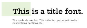
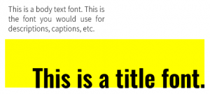
In designing a presentation or a presentation template, it’s important to always consider two fonts. These are your Display Font or Heading Font and your Body Font or Paragraph Text. Having two fonts already chosen will give you an effective way of creating hierarchy within the text components of your presentations. This hierarchy let’s you separate the big ideas from the details.
Now generally, it’s a good practice to mix your basic types when you choose your display and body fonts. For example, a traditional serif font might be well paired with a thin sans-serif font. A good rule of thumb is to vary the type, the weight of the font, and the width of the font (that is the width of the actual letters), in choosing your pairings. At the end of the day though, look at your choices and decide what looks good. What will look good as a title? What’s easy to read for the details?
To help you get started and to think more critically about your choices of fonts I’ve prepared a handful of nice font pairings below. For this post, I’m using only Google Fonts, which are free fonts that you can download from here.
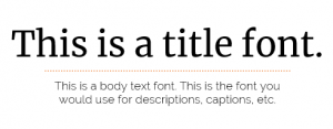
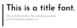
Hepta Slab + Montserrat
To me, this combination reminds me of the kind of client who’s contemporary but not too out there. They might have some traditional leanings, but they’re happy for things to feel new and delightful too.
Oswald + Assistant
This combination on the other hand is for the bold and contemporary kind of client. Do they like bold colors, prints, statement pieces? This feels like a good combination to show them a daring design that is exactly what they asked for.
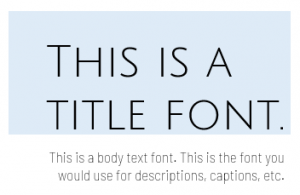
Merriweather + Raleway
This is a good combination for clients that lean traditional with perhaps a feminine edge? Merriweather is a bit softer for a serif font, but it’s not at all showy. That mixed with the simplicity of Raleway makes for a nice calm mix for an even-keeled client.
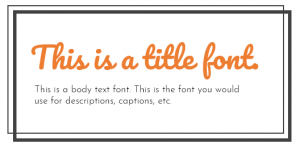
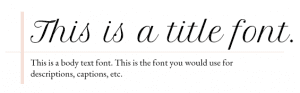
Pacifico + Josefin Sans Light
These fonts indicate a fun client with a bit of a vintage edge? The script starts to remind you of vintage signage, but it’s not too serious. Pacifico mixed with the clean minimalism of a thin Josefin Sans will only speak to a specific kind of client. But that kind of client will love it.
Playfair Display + Roboto
This combination is for someone who likes to make a big statement. There’s a little bit of glamor and a little bit of drama with it, but it also feels suitable for someone with a more conventional side.
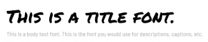
Permanent Marker + Barlow Semi Condensed
This is for your casual, trendy, edgy client. They still take design very seriously, but they don’t like old fashioned type.
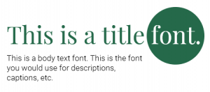
Josefin Sans + Cormorant Garamond Italic
This combination is also for a bit of a vintage lover, but in this case they take it a bit more serious. They like clean lines and love a contemporary, mid-century modern style.
Julius Sans One + Barlow Semi Condensed Light
Here’s a combination for the commanding client. This client wants there space to impress people. There not so precious about a specific style or mood, but they definitely want to keep up with the Joneses.
Petit Formal Script + EB Garamond
This combination is definitely in touch with its feminine side. There’s a softness and a sweetness to this combination that feels cool, delicate, and old-fashioned all at once. If a soft blush pink demanded to be written in a specific font, Petit Formal Script would be it.
In addition to font choices, I highly recommend that you use proper design software in creating professional documents. My go-to program is InDesign as it lets you make stylish, graphically please text and image documents easily with tools of a pro.
So what do you think? Do you have a different reaction to these font combinations?
Think about the design you’re working on right now. What font would be the best to really talk about the big ideas of that design? What font could talk about the details?
Font choice is important; make it consciously.