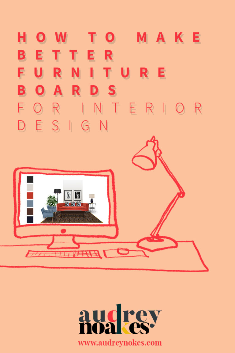
Anatomy of a Materials Presentation
Today, we’re going to do something a little bit different. So much of this blog focuses on the digital side of being an interior design. Well the reality is that there’s a great deal of physical skills needed in succeeding in this business. No, you’re not doing any building or tile laying yourself, but you do have to explore things in their physical form. You have to understand the materials, colors, light, textures (the list goes on…) that you’re proposing to use within a space. To evaluate these choices as well as present these materials you will be making materials presentations, the cooler, younger version of a traditional sample board.
I love looking at materials presentations. When most of your job is staring at a computer all day, it’s an utter delight to see such artful arrangements of beautiful textiles, gritty stone, and polished tile. Everything that you can’t show perfectly on the digital side comes alive in a materials presentation. Yet they can be really hard to pull off well.
The good ones look the three-dimensional work of some famous abstract artist. It’s a Kandinsky piece created to represent someone’s living room. The bad ones look like the designer threw a mystery bag of samples on to a board and glued the on wherever they stuck. While not everyone can produce the interior design equivalent of a Kandinsky piece, you can certainly do better than a randomized board. To help you see how, we’re going to break it down into 5 key considerations (using digital illustrations, of course). PS If you want to see some of my favorite materials presentations, I’ve created a dedicated board on my Pinterest profile for just that. Check it out here.
So my 5 key considerations for a materials presentation are:
- Composition
- Hierarchy
- Balance
- Alignment
- Polish
Composition
Let’s look at composition first. What I mean by composition is simply the logical way in which you’ve arranged your samples on a board or within a tray.
To demonstrate these considerations, I’m looking at two different examples. A living room with blue hues and a trendy bathroom full of color.
Example 1:

Example 2:

So let’s think about how the composition of these samples should be arranged according to the logic of space. The logic of space is quite simple. Essentially, things that will appear lower in your field of vision within the space should be arranged lower on the board. Things that appear higher in your field of vision within the space should be arranged higher on the board. So things like flooring will be at the bottom of a board while things like ceiling colours will be higher on the board. Let’s see this in action with the examples.
Example 1:

Example 2:

In the most abstract of ways we can start to see how these materials would interact with each other in the experience of the room. Yet, they still just look like a pile thrown on a board. Which leads us to the second consideration…
Hierarchy
Right now the materials are being given equal treatment with in the board’s layout. To be more intentional about the layout, you need to establish a certain hierarchy in what you’re showcasing. What’s intended to stand out? What’s intended to blend in?
So let’s think about our example projects. For Example 1, let’s say that really the focus of the room is the warm light leather sofa opposite the deep navy blue shelving. These are our most important elements. The design is much less focused on the wall color and wallpaper. This contrast between the sofa and the shelving is the focus.
Since that’s the focus, we want to place those samples in the center of our board.
Example 1:

Our bathroom example is a little different. For this design, the mix of textures at the vanity, the green cabinet, the light blue tiles, and the various hardware is the focus of the design. Certain elements like the wall color and trim color and even the dark flooring will be a bit more secondary. So we make sure those elements have hierarchy.
Example 2:

So now the arrangement is getting better, but it’s still not as good as it can be. What it’s missing is balance.
Balance
Balance is the design principle referring to an even distribution of visual weight. There can be symmetrical balance and asymmetrical balance. With materials boards like these, typically asymmetrical balance will be the more typical practice. Now the important thing to keep in mind is that for these we aren’t meaning a literal visual balance on the board, instead of a visual balance that takes into account the hierarchy and composition that we’ve already determined.
Example 1:

For this sample board, because there are so many materials going on, to achieve a balance in the background we’ve simply painted the ceiling color in the background. Then the heavy appearance of the navy painted trim for the bespoke shelving acts as a datum line for the various materials to be placed on either side. The heavy texture of the wool poms of the rug and the plant leaf cause a heavy visual weight on the left. To offset this the boldest colors of the design are placed on the right. This helps you achieve a visual balance even in an asymmetrical composition.
Example 2:

This one is a little different. There’s no central datum for us to build off of. Instead, There’s actually a strong visual contrast between the floor tiles and many of the other samples. Because the floor samples are occupying the bottom and right side of the board, to help visually offset this we’ve added the color of the trim work in the background on the top left. The color isn’t overwhelming but giving it so much space on the board helps us achieve some balance in the board. Then there’s essentially an L-shape of the darkest samples, while the textured vignette of samples around the vanity are grouped together. Playing with what is essentially two different groupings of samples helps create the balance for this board. Keeping the groupings with the heavy and dark samples simple helps offset the heaviness of the samples. The visual lightness of the other grouping is made weightier by the layering of multiple textures.
This is how you can begin to achieve balance in your materials boards.
But we’re still missing a major element. (And perhaps it’s just a pet peeve but…) this is my favorite element for a really professionalized presentation. This is Alignment.
Alignment
Alignment is how you can ensure the arrangement appears intentional and with consideration (which it is, of course). This is an important step in formalizing your materials presentation, because you don’t want to have elements look coincidental or accidental in the arrangement. Now alignment can take two forms. There’s center alignment or edge alignment. Which one you choose ultimately depends on the samples and how your samples are arranged up until this point. However, adding this extra level of attention and care will formalize the presentation.
Let’s see it in action.
Example 1:

Example 1 is largely relying on aligning the edges of the samples.

Example 2:

Example 2 on the other hand is largely using center alignment to organize the samples.

Now it’s time to add the final polish.
Polish
If your materials presentations are intended for your clients to see, you’ll want to add an extra polish. By polish, think things like your logo, labels, or a key.
Let’s look at our examples:


These are two distinct approaches but you can see how this extra level of polish ensures the materials presentations are ready for a client presentation.
Until next time,
Audrey