CAD Plans: Styled 10 ways
CAD Plans are just so boring looking.
This is something that when I hear it, I get a little sad because a great plan drawing can be beautiful. It can help communicate the design and space in such a concise and effective way that even 3D visuals can’t compete.
There are very few things a designer can create that offer such a complete visual illustration of the design and ideas being offered as a well-presented plan drawing.
But the question may be, if that’s true, how can we make them look a little bit better? …where they look tidier in a drawing set or where they stand out in a presentation or a portfolio.
Well, I’m here to explain 10 ways you can style your CAD Plans to help them look a little more polished.
First things first, these are styled within CAD programs. You can also render a floor plan, which I cover in this blog post and video where I render a CAD drawing in Photoshop for that extra level of detail in less than 30 minutes.
But for more instant fixes that can be adjusted with layers and line work in your CAD program, this list of 10 is for you.
Now I’m using AutoCAD LT to create these drawings, this means all of these styles are possible via few quick layer adjustments and changed hatch colors. However, there are likely solutions in other CAD programs too.
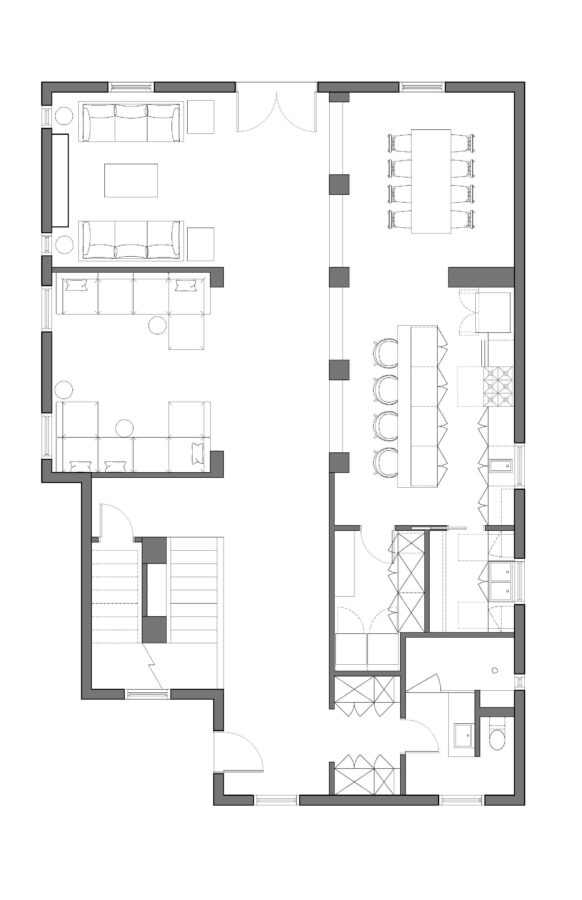
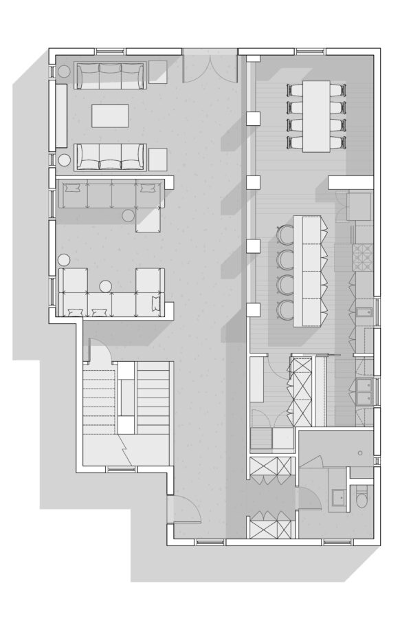
The Classic – Black and White with Black Fill
This style is achieved via a simple black solid hatch as a fill within any walls or columns. This style can be really effective in making sure the architecture of the space stands out and easily understood. On the other hand, it can sometimes be a bit of a harsh graphical style. The walls become the most dominant part of the drawing so sometimes other styles are more beneficial.
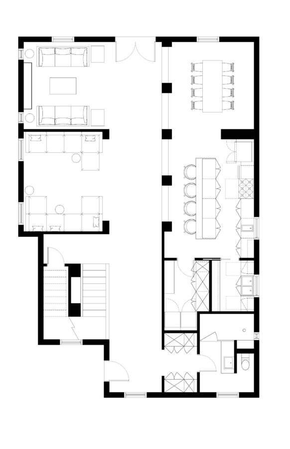
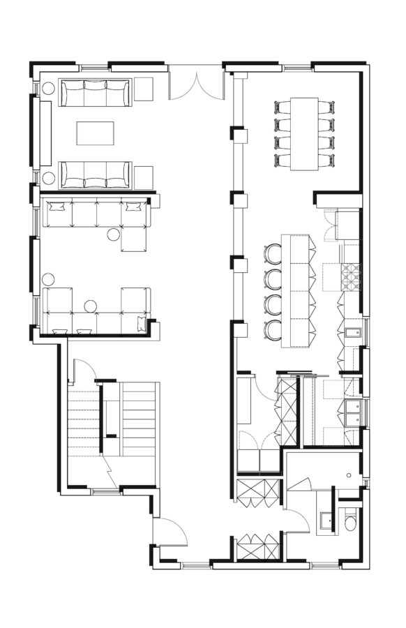
The Minimal Classic – Black and White with White Fill
Now, this is one of my favorites just because it’s simple and clean. AND it really lets the interior do more of the ‘talking’. This is achieved by just replacing that solid black hatch with a white one. You still have the contrast between the interior and the ‘cut’ structures via line weights but the heaviness of the fill doesn’t distract from the interior in this style.
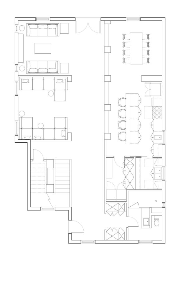
The Modern Classic – Black and White with Grey (Or any color!) Fill
As a bit of a best of both worlds, the alternative choice would be to use a grey or other color to fill in the walls. This can be a color that’s relevant to the design to help with the presentation or it can still with just the greyscale to keep it more in line with technical drawings. This style is a lot less harsh than the black hatch style but gives you more contrast compared to the white fill.
The Minimal Textured – Black and White with White Fill and Grey Hatches
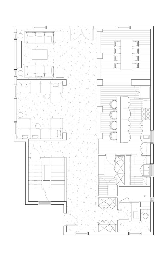
Hey, sometimes, you want to show off the materials being used within a particular design. If that’s the case, a selection of properly scaled hatches – with a grey hatch and plain white background – can do a great job of making a technical drawing have a bit more character and information. This also helps create more of a contrast if you’re using a white fill. This is another style that really helps the interior standout compared to the ‘cut’ parts of the plan/design.
[elementor-template id=”13556″]
The Modern Textured – Black and White with Grey (or any color!) Fill and Grey Hatches
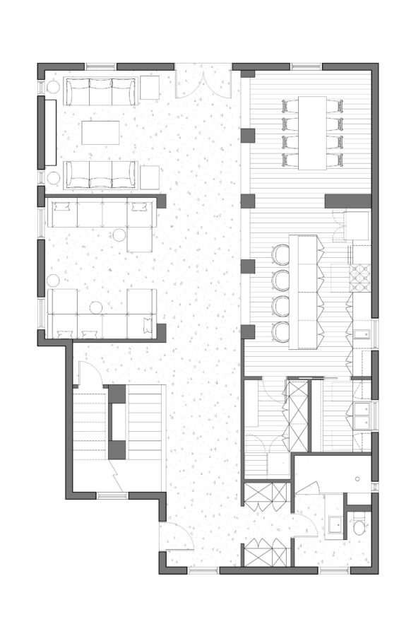
Again, if you want to give a bit more contrast, you can add a grey or colored fill to the walls. With the material hatches, this can still create a more textured and character-filled drawings.
The Ghosted Interior – Black Fill with Grey Interior
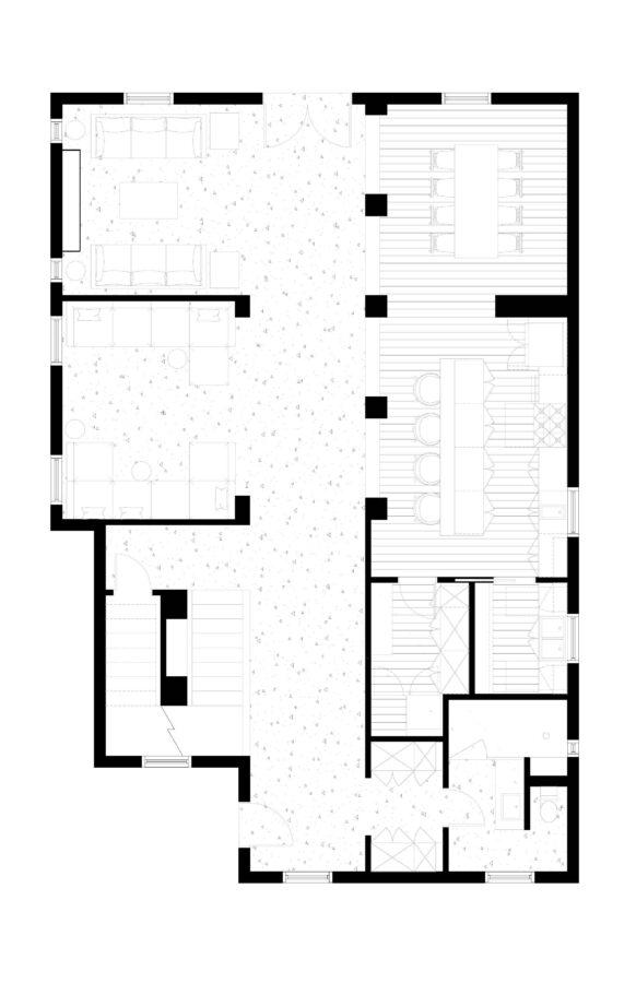
I feel like I see this style on Dezeen or Archdaily a lot. It’s like it’s really all about the ‘cut’ walls and columns. However, adding the furniture and any textures in a light grey still helps communicate this extra level of information rather than just having an empty floor plan.
The Shaded Layout – Black and White with White Fill plus Grey Transparencies to mimic lighting effects
This style is all about the light! Basically to create this style you have a white fill hatch at the very top of your drawing and then various layers of transparent greys below it. Now I’ll admit, that for this example, I made it pretty quickly with just a 45-degree angle and creating some polylines to create these fills. It would take you a bit more time to get shadows more accurately, but as a quick exercise to help communicate more depth, these transparent hatches a can be a quick win.
The Bold and Graphic – Black and White with White Fill and Black Offset fill
This one is definitely only appropriate for presentations but I love the bold graphics it makes. Basically a solid white hatch is copied and pasted, changed to black, sent to the back of the drawing, and offset where it’s almost like a weird drop-shadow for the walls. It starts to mimic the graphic design of vintage and bold typography so it can be a really interesting way to style certain types of designs.
The Bold and Colorful – Colorful and Stylized for Presentation
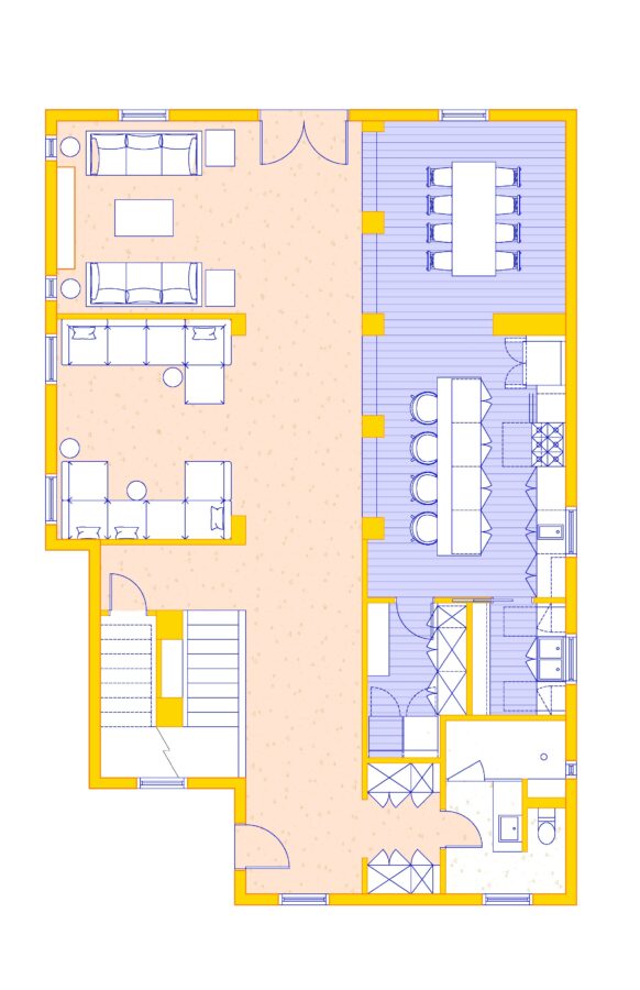
Now this one is another worth only really to explore for presentation. That said, the colors can be chosen to help complicate the design, the client’s branding for commercial spaces, or just accentuate the presentation of the design.
The example was created with a yellow fill hatch at the walls and a dark yellow outline at those walls. Then all the furnishings and fixtures are in blue. The two hatches are in those same color families to blend nicely with the yellow and blue but with a bit more change in value to make sure it’s not too loud.
The Bold and Monochromatic – Colorful with a single color and Stylized for Presentation
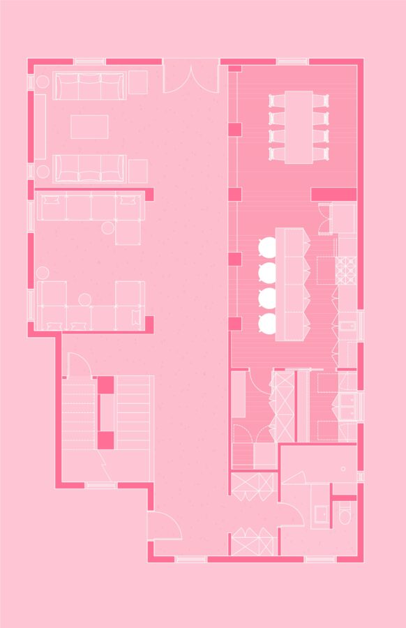
This one is very, very bold.
Now this can be done with any color, but I thought pink made it really standout. Here all the lines are white while the fill hatches are in various shades of the same hue. This could be as bold as pink like the example, or as subtle as a sandy neutral. This can be really handy as a technique in presentations when you need visual support that has a bit more presence than the white background of a typical plan drawing.
That’s all for now! I hope this has given you some ideas on how to style your CAD plans. I’m curious to know, do you have a favorite style that’s missing from this list?
Honestly, I’m a drawing style nerd, so send me any updates that should be made to this list at audrey@audreynoakes.com.
Until next time!
Audrey